
Landing pages have been successfully stepping around the world for the last 10 years. During this time, they staged a revolution in the world of web and proved their efficiency by showing groundbreaking results in increasing sales and conversion. That is why the amount of companies which want to set up a landing page is growing every day. You may think that it is good because landings are simple, brief and informative, but reality is not so optimistic. The problem is that only tiny amount of companies are preoccupied about its development and design. The majority of people opt for low price or do it alone instead of paying adequate price for fine product. To help you not to make false steps, we deeply analyzed insights and outs of landing pages and want to present you tips how NOT to do a landing page.
If you want to make your landing page efficient, avoid the following:
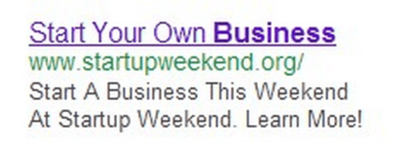
1. Unsuitable heading or its absence
The famous Russian director Stanislavsky said that “Theatre begins at the cloakroom” and it is also applicable for headings as it the first thing people see after clicking on a link. It should be catchy and intriguing to engage visitors to read more. Remember that you never get a second chance to make a first impression.
2. Meaningless text
Landing page without high quality and targeted text is just unnecessary money waste. Text is the king, it’s the main tool of sales. It has to cry with all might about the product’s benefits and goodies. It has to be clear understood, informative and brief at the same time to make people stay at your page.
3. Blind aim
Would you buy a pig in a poke? Approximately, no. We too. And all the customers are on the same page. According to the researches, you have not more than 10 seconds to involve visitors. Otherwise, they will leave it at a time.
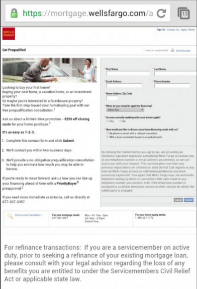
4. Call to Action that doesn’t call to action
Selling button has to clarify customers what will appear after pushing it. The good idea will be to name them starting from the words “sign”, “get”, “talk”, “find out”, “start”. You’d better avoid using phone numbers and obtrusiveness.

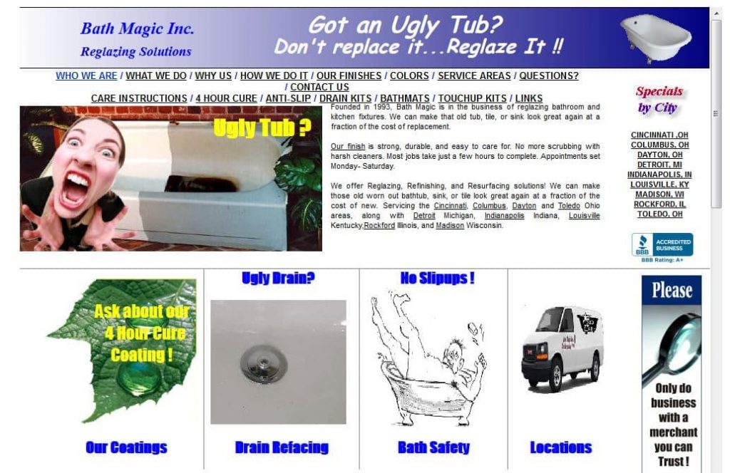
5. Clichéd photos
Men with brief cases, handshakes, shamly smiling employees – all these discredit you in the eyes of customers. Most people understand that these photos are fake and conclude that you don’t want to show your real appearance. Are you sure that you want to make this kind of impression?


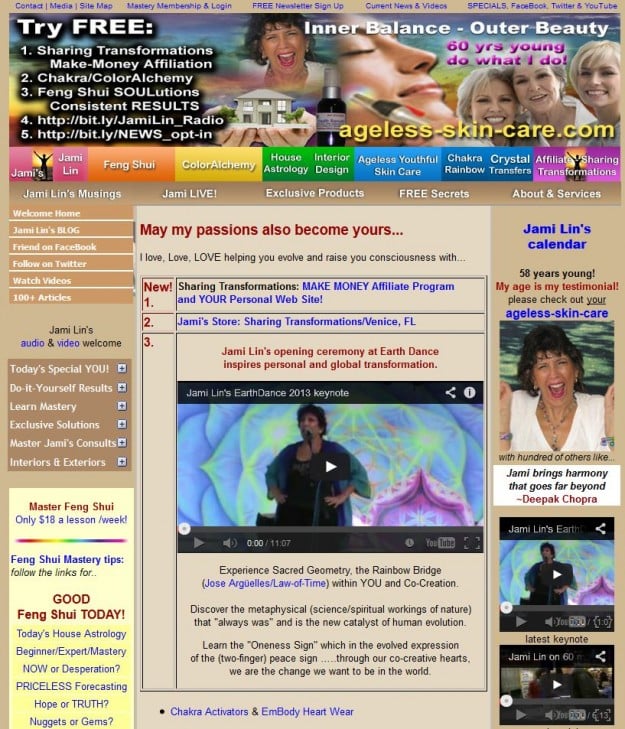
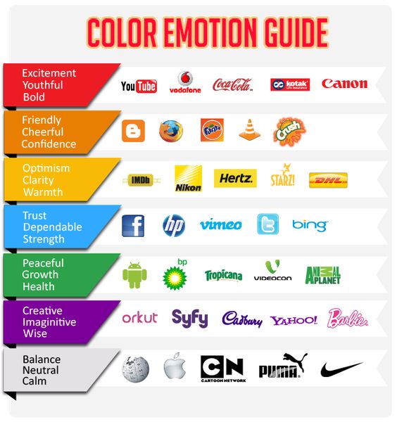
6. Poor color combination and design
In the world of design there is a special rule of color combining (which colors harmonize, which not, which color is in charge of creativity/balance/excitement and so on). Before developing the design better look at this picture and think through the strategy.
7. Grammar mistakes and too many punctuation marks??!!
Certainly, punctuation marks are the integral part of speech and writing. But putting them in season and out of season is not the best idea. Especially if it completes with grammar mistakes, together it represents a perfect recipe for disaster.
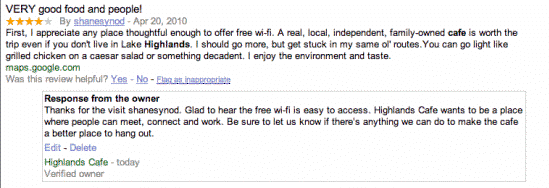
8. Absence of proficiency testing
People better trust actions rather words. And the best way to persuade visitors in your proficiency is to demonstrate them completed projects or portfolio. Showing reviews from real people is even better yet.
9. Being not optimized for mobile devices
Reality shows that the amount of smartphone users is sustainable growing. Recent researches demonstrate that customers suppose mobile versions of web sites to be more important than the web ones so it’s foolish to figure only on full versions. Develop responsive versions, create user-friendly design and see how rapidly your sales increase.
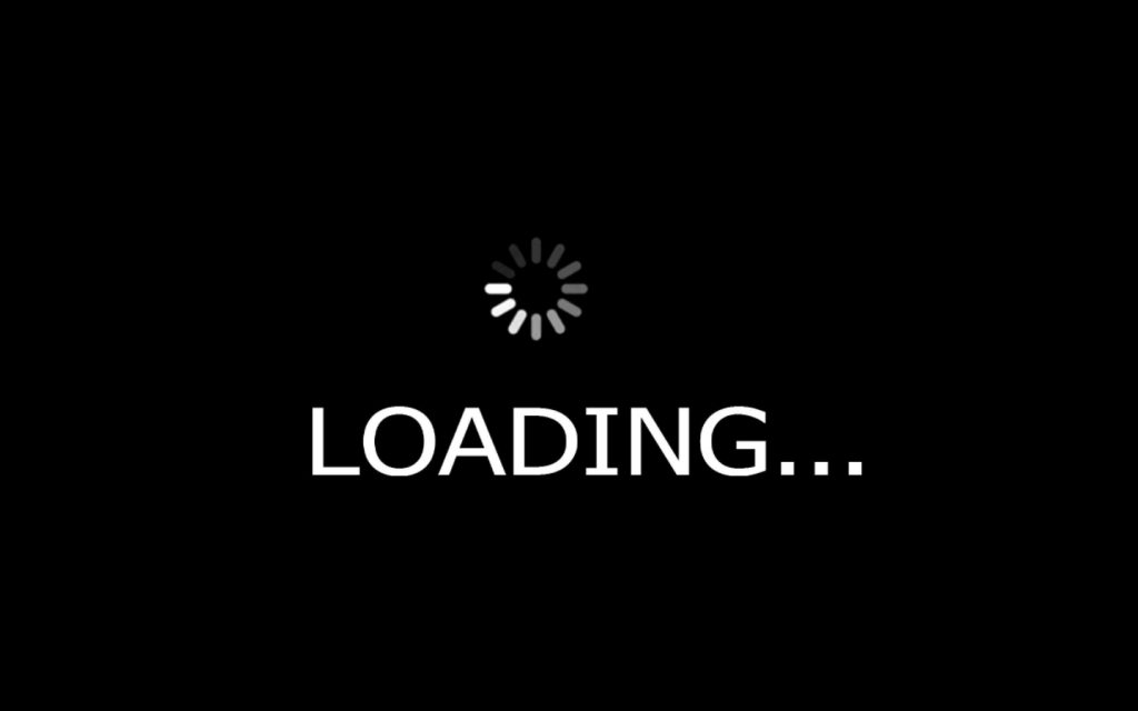
10. Slow loading
In previous posts we several times mentioned that people don’t enjoy waiting, especially on the Internet so don’t make them wait until your site load. The slower the loading the lower the conversion.
Actually, the main conclusion is that different groups of people value different objects and things. The best way out to is to talk the same language with your target audience, focus on up-to-the-minute problems, in other words, side with them. Then they will take a liking to your site and follow instructions (how to achieve it you can read here).
So, to follow the instructions above or not depends on you. But if your goal is to rise to the occasion, you’d better think first, then act.
And a question to you: have you ever noticed such fails on the Web? What items of the listed above irritates you most? Share your thoughts with us!