
The modern smartphone seems to be a serious rival for a desktop computer due to its rapid development. Maybe now it is too early to think about the replacement of our PC’s, but the future is coming way too fast.
Smartphones are powerful enough to perform the same tasks as desktop computers do, it is true. Let’s face it: most of us still prefer to use PCs due to its screen size and more habitual control. And that what holds the desktop computers afloat. And while we are still using computers for work, smartphones are often used for web surfing and shopping. Due to its compactness, and the coverage of a modern mobile internet, you can do it nearly everywhere. But not always as fast and convenient, as on your desktop computer. The reason why is that so, most of the web pages are still not optimized for mobile devices.
Considering the fact, that even pretty “clean” web pages have lots of functional elements, mobile optimization requires more than just responsive design. Lots of features influence the way your site looks, loads, acts and operates on the mobile phone. And if you don’t want to scare away your visitors, let’s look at what possibly can be done with your site.
If you know your “Why”, you will know your “How”
We have already written about the difference between adaptive and responsive design here. Google recommends using responsive design because it doesn’t require splitting your site to the different domains. That will help you to avoid lots of problems with search engines. Responsiveness adapts the content to any screen size, making it fit each device.
Having one site is better in terms of SEO, easier in terms of updating it, and cheaper in terms of marketing and promotion.
When we are talking about the website, that intends often usage or work with smartphones hardware, the mobile application is more suitable. It depends on your target auditory and your site specifications. A native application for a mobile site is more appropriate if you need to provide:
- Offline access
- Daily usage and personalization (for example bank account mobile applications)
- Native functionality (like Instagram broadcasting)
- Features like push notifications
If your site doesn’t have to perform some difficult calculations for users or using mobile phone processing power, probably you should choose a lighter variant to perform basic functions. Applications can include all the content from the site, or be a partial addition. The only problematic thing is that applications are to be installed on the smartphone. And it will require more memory with updates. If the user won’t use it on a daily basis, probably he will delete it.
And don’t forget about one important thing: any of your site pages should be accessible without downloading an application. You may be familiar with a Facebook Messenger application problem.
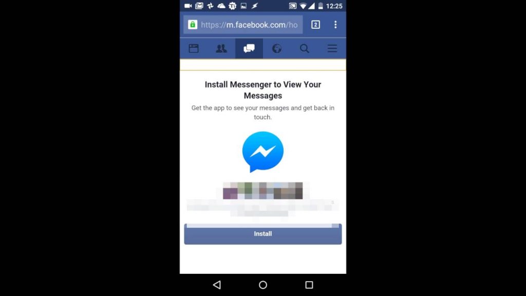
Facebook denies observing your message page without loading an application, making it impossible to read messages through the browser. Better not create such stumbling stones for your users.
Let’s also not exclude splitting your site in two. Building a mobile version allows you to give your users a fully functional alternative to use. So, basically, it is just a smaller version, that it placed on a subdomain. Redirect link is placed on your main site and here you go, visitors can view it.
Mobile version has a list of advantages:
- Available on different platforms without adapting
- Can be easily shared by URL unlike the mobile application
- Upgrades and changes can be instantly visible
- Easy to find via search engines
Google recommends to make your site responsive rather than creating a mobile version. But still, it is a good alternative, till it works.
Mobile friendly, but still have enemies
Among all the optimizing issues, there are a few caveats. When your site is already working on the mobile phone, it doesn’t mean that nothing prevents the user from viewing it. As there are always multiple ways to solve the problem, we will mention what you’d better avoid.
For example, in January 2017, Google started to punish sites with annoying pop-ups. We are all closely familiar with those hard to switch off pop-ups, that have an extremely small button. Interstitials and big pop-ups caused a reaction from Google, that started to make penalties for sites, that have them. So, to keep up with Google rules, make sure your website doesn’t prevent users from a calm presence on the site.
Another detail we want to mention is a difference between a desktop version of the site and mobile one. The thing is, sometimes mobile versions are made “lighter” and “cleaner”. That is done for improving loading speed and removing desktop functions. Which sometimes can lead to the big difference in content between the site and its mobile version.
By the way, loading speed comes is one of the main factors as well. Considering that mobile internet is still not perfect, and people load pages while walking, it should be pretty fast. Loading site for more than 20 seconds sometimes can make a user fly in rage. So, make sure your site or application is fast enough.
As the conclusion
Mobile technologies are developing rapidly. Statistics of the last years show an enormous growth of mobile e-commerce, as in 2015 40% of all the purchases were made via mobile phones. And in 2017, those numbers are to rise up to 70%. And it is not only about the commercial part. So, don’t stay apart from the progress.
Choose properly between the variants. Having a good application for a right purpose is never an odd thing, besides a well-optimized site, or its mobile version.
Do you use responsive design on your site? Share your experience!